
 As an email marketer, I’m constantly overanalyzing the emails I receive. I even have a dedicated folder in my inbox labeled “awesome emails” to save specific emails that stand out.
This past summer at the Email Design Conference, Kevin Mandeville from Litmus asked what I found to be an interesting question, “What is your favorite email you’ve ever received?” Think about it. Do you have a favorite email? If you do, there is something about that email that makes it memorable. Maybe it’s the subject line, the offer, or the imagery. Or, maybe there is a company from which you receive emails that you love. Which leads to his other question, “Who are your favorite email senders?” An email that makes you giddy when you see it in your inbox and never goes unopened.
I take inspiration from the emails I get excited about (yes, marketing geek right here, I get excited about emails) and I ask myself what I like about it. What is memorable? How can I get our email recipients to feel that same emotion? Here’s what I’ve learned.
In order to be memorable, your email needs to be designed for emotion. Meaning, it needs to create a human connection. You can do this by delivering an experience for the end recipient that allows your brand to shine through. Delight your customers with design elements and occasional “Easter eggs.” This will encourage your subscribers to establish a relationship with your brand and message.
In this series, I’ll share simple techniques I love and have embraced in my emails to help them stand out in the inbox. Techniques that deliver an experience. First things first: Preheader text.
Preheader text is valuable real estate.
Are you taking advantage of preheader text in your emails? If you aren’t, you definitely should. Litmus says 75% of emails are displayed with preview text in the inbox. Typically this space is wasted with repetitive text or by asking someone to view something in a browser that they haven’t even opened yet. This. Is. Bad. While it doesn’t affect the design of your emails, it can be a contributing factor to your open rate. Incorporate this element of the email into your checklist. Rethink your strategy and see results.
Preheader text should be enticing. Similar to a subject line, it’s text copy that can compel the reader to open the email. (P.S. Preheader text is a snippet of code in the body tag of an email. It can be coded in such a way so that it’s hidden when the actual email is open. Sweet!)
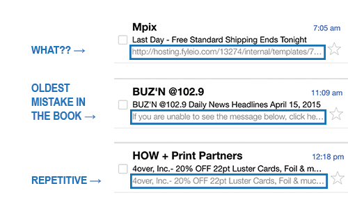
Here are some examples I’ve noticed inside of my own inbox of senders using preheader text poorly:
Here are some examples inside of my own inbox of senders using preheader text effectively:

Courtesy of Litmus, here’s the snippet of HTML that can be inserted within your email’s body tag:
<body>
<div style=”display:none;font-size: 1px;color:#F4F4F4;line‐height:1px;font‐family:Arial, Helvetica,sans‐serif;max‐height:0px;max-width: 0px;opacity:0;overflow:hidden;”>Text Goes Here </div>
…</body>
Sending mediocre emails is no longer acceptable; adapt preheader text as a best practice for your email campaigns. Until next time, my friends. #EmailRocks